The Different Types of Infographics and How to Use Them
If you’re like most people, you spend hours each day reading articles, scrolling through social media feeds, and watching videos. But how do you digest all of that information? Chances are, you’re using infographics to make sense of it all. Infographics are a great way to quickly and easily understand complex topics. But with so many different types of infographics out there, it can be tough to know which one is right for your content. In this blog post, we’ll look at the different types of infographics and tell you how to use them. So keep reading to learn more!
The power of infographics: how to use visuals to increase engagement and conversions
 As a marketer or business owner, you’re always looking for new ways to communicate your message better and reach your target audience. One of the most effective ways to do this is through infographics.
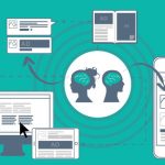
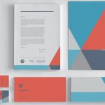
Infographics are visual representations of information, data, or knowledge designed to be easily understood and shared. They can take many forms, but all infographics have one goal: to make complex information more digestible and accessible.
While infographics have been around for centuries, they’ve exploded in popularity in recent years thanks to advances in design software and the widespread adoption of social media. Today, millions of infographics are circulating online, with new ones being created daily.
With so many infographics, it can be tough to know where to start. But don’t worry – we’ve got you covered. In this guide, we’ll introduce you to the different types of infographics and show you how to use them in your marketing.
Types of infographics: the best ones to help you engage your audience
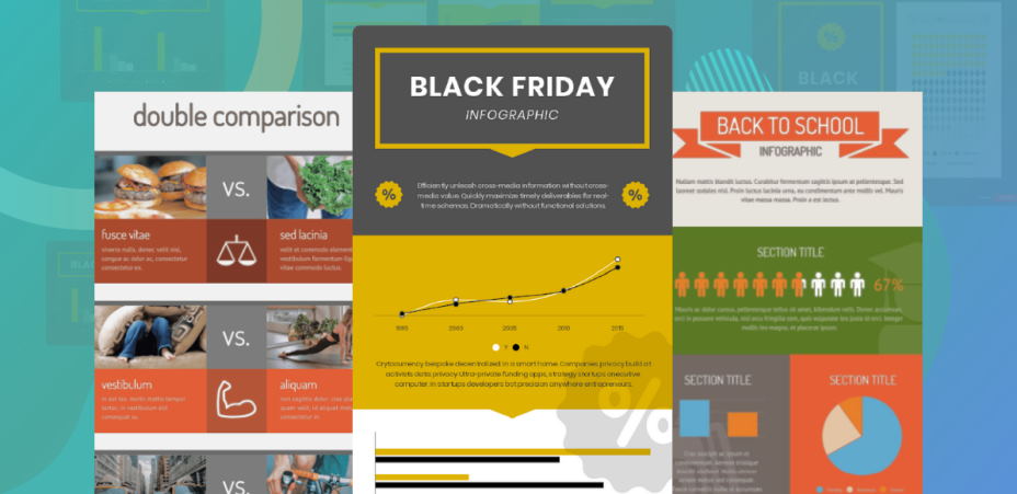
Infographics come in all shapes and sizes, but there are really only four main types: data visualizations, timelines, process diagrams, and comparisons. Here’s a quick rundown of each type, plus some tips on when and how to use them.
Data Visualizations
Data visualizations are perhaps the most popular type of infographic. They take complex data sets and turn them into easy-to-understand visuals, like charts, graphs, and maps. Data visualizations can make even the driest topics interesting and engaging when used effectively.
Timelines
Timelines are perfect for conveying historical information or detailing the steps of a process. They can be linear or vertical and often use icons or other visuals to help readers follow along.

Process Diagrams
Process diagrams are similar to timelines but focus more on the relationships between different elements. They’re often used to explain complex systems or processes and can be especially helpful in visualizing cause and effect.
Comparisons
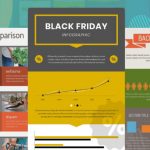
Comparison infographics are a great way to highlight the similarities and differences between two things. They can be used to compare anything from products to historical figures, and they usually use charts or graphs to illustrate the data.
When choosing the right type of infographic for your needs, it’s important to consider both the data you’re working with and the message you want to communicate. For example, data visualizations are perfect for complex data sets, while timelines and process diagrams are better for conveying information sequentially. And if you’re looking to compare two things, a comparison infographic is probably your best bet.
Remember that less is always more, no matter what type of infographic you choose. Too much data will overwhelm readers and make your infographic difficult to understand. So focus on selecting the most important points and visuals, and leave out anything that isn’t essential.


 I’m your host, Agustin Hall, a graphic designer in Tampa, FL. I opened my independent studio in 2009 and I’ve been designing logos (and a few design books).